LIFESTYLE: A Bathroom to Inspire
Thinking of remodelling your bathroom? It can feel a little daunting knowing where to begin. We catch up with two home owners and newbie renovators to find out about their project….
What were some of the obstacles you faced with this project?
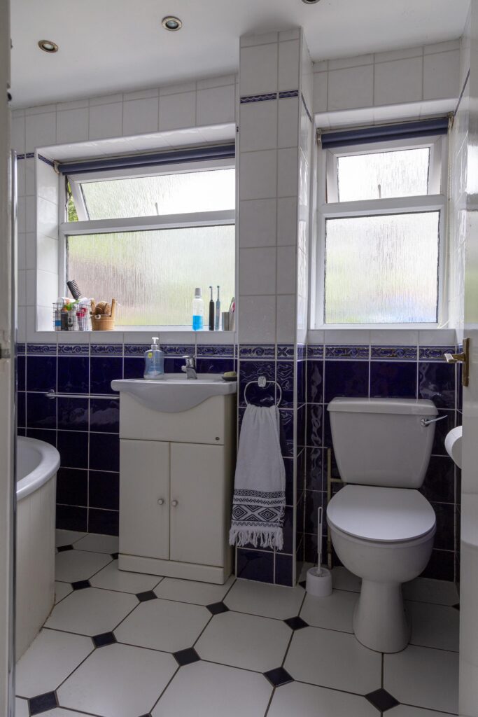
Our main objective with this project was to refresh and update the room. The bathroom was 20+ years old and in need of both a practical and an aesthetic overhaul. We were quite happy with the layout of the room, so in that sense we weren’t looking to reconfigure the space, it was more a case of refreshing and redesigning the existing layout. This was certainly of some comfort to us as we were very much newbies to renovations of any kind!
One literal object we were hoping to conquer was a column, originally positioned between the sink and the toilet. Fully tiled, it was difficult to know what exactly might be behind it, although the plumber suspected it was the waste pipe. He informed us that it should be possible to get rid of it, cut the pipe down to a more discreet level and hide it within a new sink/toilet unit. But it was a risk, as he couldn’t be certain what was lurking within the column. Luckily his guess was spot on as it was indeed the waste pipe.
Another issue we faced once work began was that once the tiles came up, the floor was unfortunately almost completely rotten. So the timber needed replacing, which we had to just put down to being one of those things!
Did you have a certain design or look in mind?
In some sense yes. I knew the type of look I was hoping to find in terms of the tiles. And luckily Tile Choice had such a wide range that we were able to find something that we loved very quickly. We wanted to fully tile the room as we intended for the space to be a practical family bathroom, and therefore we needed it to be easy to clean! So we were after a tile that was practical but stylish for both floors and walls. I was seeking a beige porcelain tile that had a sort of rustic natural stone look to it, while also bringing a warm tone to the room and so the Naples Beige range of wall and floor tiles ticked every box for us! They sent us a full sized tile sample which was great for us to get a feel as to whether it worked for the room, and there was even a feature on the website where you could upload a photo of your room, and then preview how the tile visualises, which was handy for us to do before we committed.
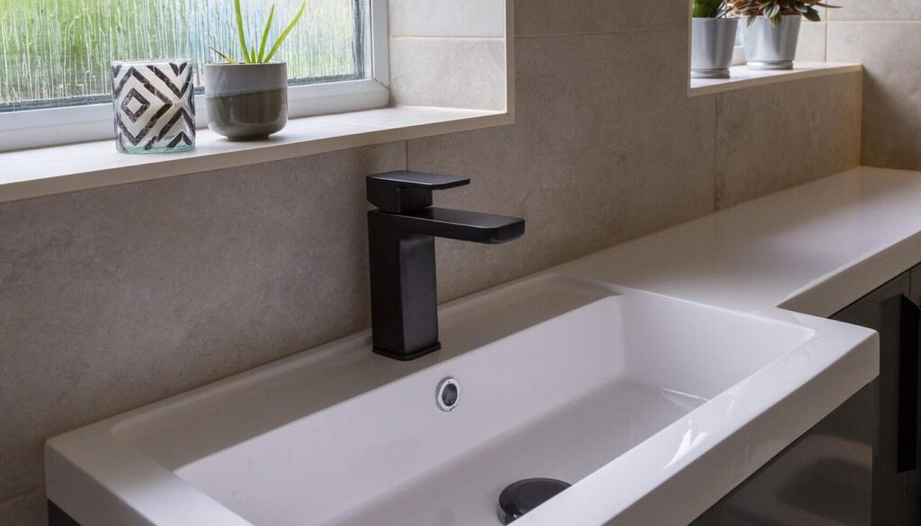
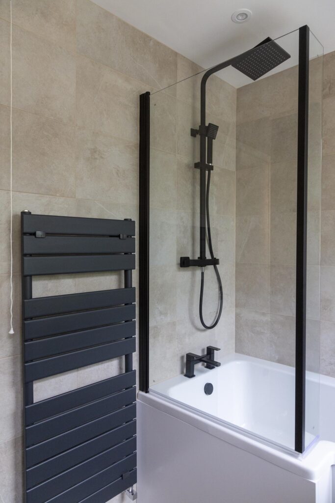
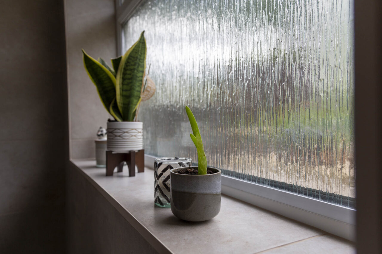
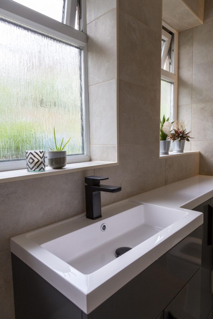
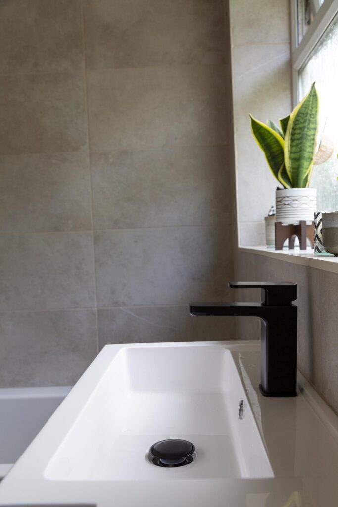
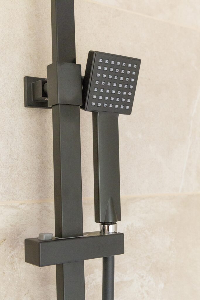
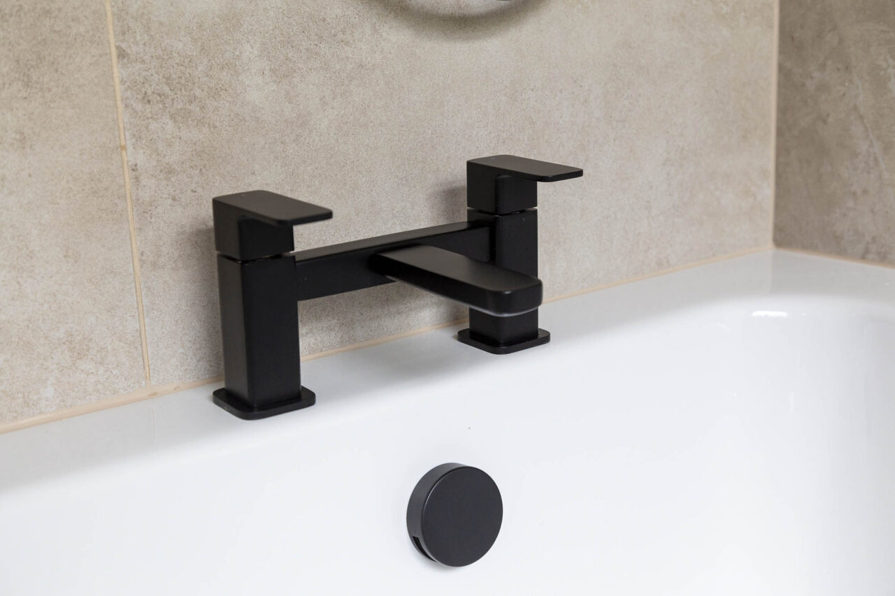
I was keen for there to be a monochrome theme in terms of some of the bathroom features. We are lucky with the amount of light that comes into the bathroom. Despite the room being north-facing, the windows are so large they’re almost their own feature wall. So we knew we could afford to be a little bold and include a few splashes of black and grey in the room. I had fallen in love with a shower set in the Nuie Bathrooms brochure that was available in matt black, and so we decided to continue the matt black theme and pair it with matching matt black taps, vanity unit handles, shower screen finishes and flush button, as well as a anthracite coloured heated towel rail and vanity unit. We felt that, combined, they tied together very nicely, and when combined with the Naples Beige tiles, created the right amount of warmth and ambience.

We knew that we wanted a vanity unit to stretch across the area where the existing sink and toilet lay. All being well, with the column removed, this unit could sit comfortably in the space, and therefore encapsulate the cistern of the toilet. So we just needed to find a design that suited us. Nuie Bathrooms had us covered. They had a range of bathroom furniture that really fitted with our vision. But something we found incredibly useful was their online interactive 3D design tool. It was invaluable during the design process and was so easy to use! All that was required of us was to input our room dimensions, and then we were free to browse their entire catalogue of products and styles. It really brought the project to life for us and quite quickly we found a vanity unit that worked both in terms of size but also style.
What would you say was the biggest focus area for you when it came to remodelling?
We of course wanted to completely refresh the room, but if I had to choose, then I would say the bath was the main focus. We are looking to start a family in the not so distant future, and with this room being the only bathroom in the house, a new fully functioning bathtub was extremely important to us. Our previous bath was a crescent shaped jacuzzi-style tub. The air jets had never worked since moving into the house, and they were always a pain to clean. We found that no matter how much you doused them in bleach, you never got rid of all the grime within them, and as such whenever you drew a bath you would notice all sorts of dirt seep out. That and the fact that there was barely any enamel left meant that we pretty much had never taken a bath since moving into the property!
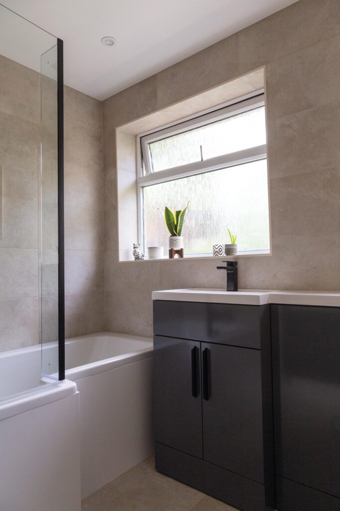
We knew we wanted a bathtub that stretched the entire width of the room, but we also decided (while using the 3D design tool), that an ‘L-shaped’ bath suited the layout of the room best. Our bathroom is not the largest of rooms, and this shape of tub would utilise the space, while the shower screen would help create the illusion of a larger room. Plus, having the bathtub spanning the full width of the room meant optimum space for a relaxing soak at the end of a hectic day.
What storage solutions does the new bathroom offer?
We wanted to go for a clean look with the new design, maximising the feeling of space as much as possible. Therefore it was important that the vanity unit offered a decent amount of storage. The Nuie Hudson Reed Fusion unit ticked a lot of boxes for us in this sense, as visually it offered a sleek, stylish and modern look, while also featuring two sets of cupboards for all our toiletries. Since it has been installed, we have actually found ourselves looking for bits and pieces to fill the space (even with the waste pipe hidden within it)! This ample amount of space has meant that we don’t need to clutter the windowsill and bathtub with toiletries, giving the room and all its gorgeous features a chance to shine.
The overhead shower system looks like a bit of a feature in itself!
It’s beautiful isn’t it? We were really keen to purchase an overhead shower, but I also wanted one that had a rinser kit arm also, to allow for those days when you aren’t washing your hair. I have always dreamed of owning one of those showers! And with it being available in matt black, it really has established itself as a feature of the room, as well as tying in beautifully with the matching monochrome taps below it.

Did you opt for any tech products?
It may of been a bit of an unnecessary purchase in some people’s minds (including my husband’s at the time!) but I had always wanted a heated mirror. I loved the idea of actually being able to see yourself in a mirror once you were out of the shower. Pebble Grey Ltd offered a wide variety of styles, and I loved the simple black frame that surrounded this one, as well as the warm ambient LEDs. I am pleased to say that once it was installed, my husband became a complete convert, and now uses the light feature on it more than the main bathroom lights! It is has a motion sensor that makes the mirror contactless to switch on and off – a nice hygienic feature, as well as adding to the sleekness of the design.
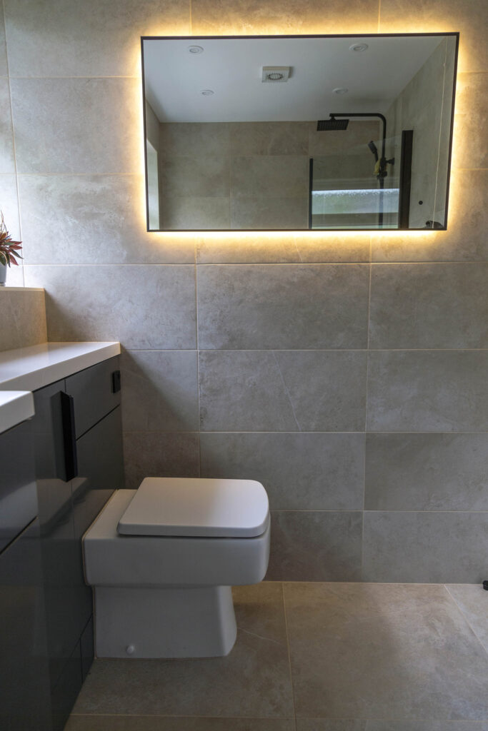
Our main goal with the refit was to create a bathroom that felt like an escape, and to ensure that clutter was kept to a minimum. And I think we have managed to achieve this through smart choices that are both practical, yet provide a sense of clean, chic style. We couldn’t be happier.
STOCKIST INFORMATION
For bathroom furniture, ceramics, bath, shower, screen, heated towel rail and taps: Nuie Bathrooms
For floor and wall tiles: Tile Choice
For heated mirror: Pebble Grey Ltd
Bathroom fitted and installed by: JD Kitchen and Bathroom Installations
